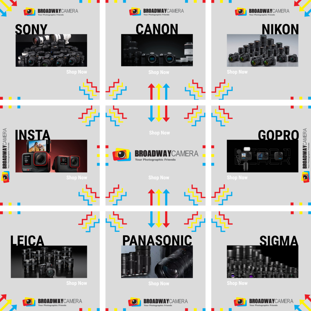
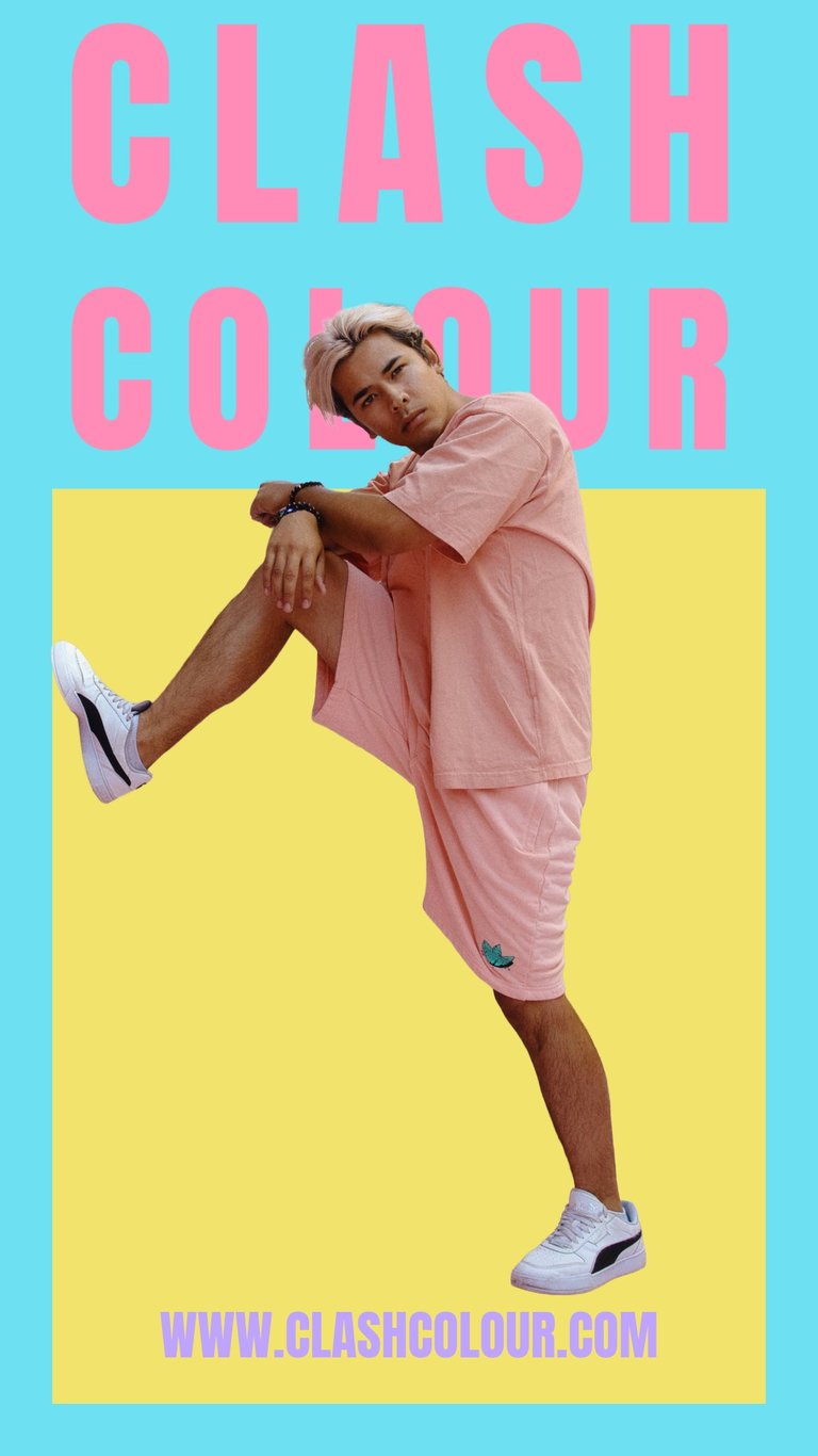
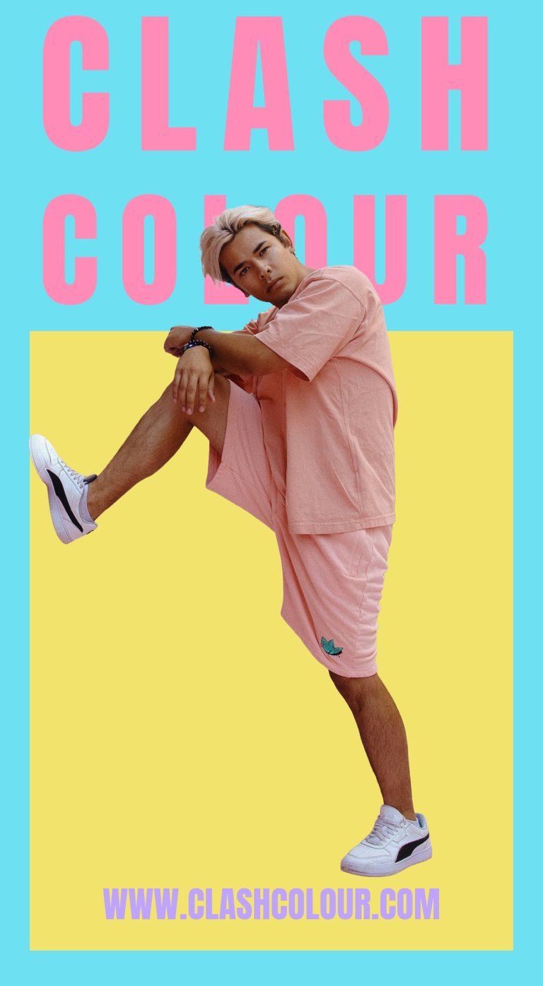
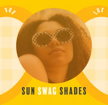
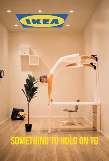
NOTE: Photos provided by company and visual design by me
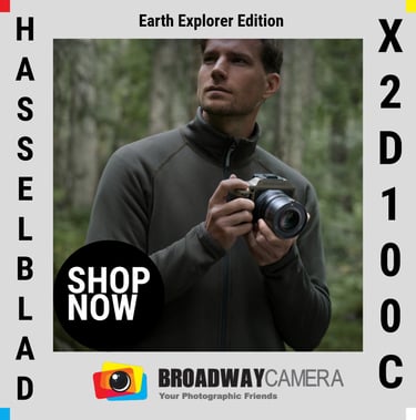
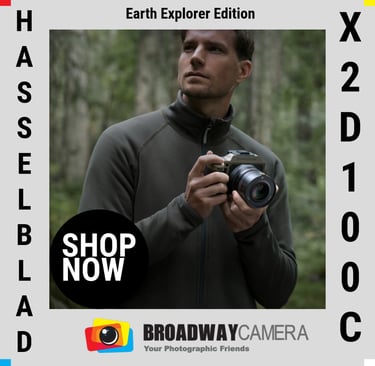
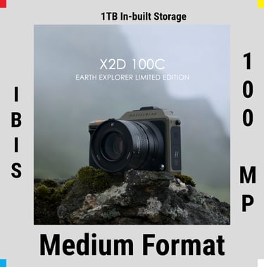
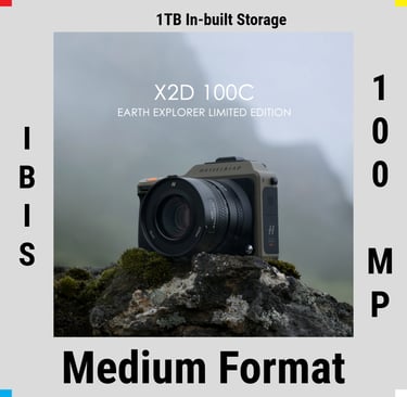
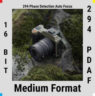
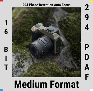
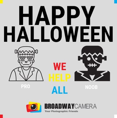
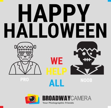
I focused on creating a vibrant and playful design that would resonate with a younger audience while staying true to the brand’s core identity. I used the colors from their existing logo—primarily bold blues, yellows, and reds—to ensure brand recognition. It leaned into quirky, fun visuals with a modern, youthful feel to keep the content engaging. Given that it’s a camera shop, I incorporated light photography lingo and catchy phrases that would appeal to enthusiasts and casual users. Minimal technical jargon, focusing instead on highlighting camera features with precision and clarity, ensuring the posts were informative without being overwhelming. This balance made the account approachable while showcasing expertise.
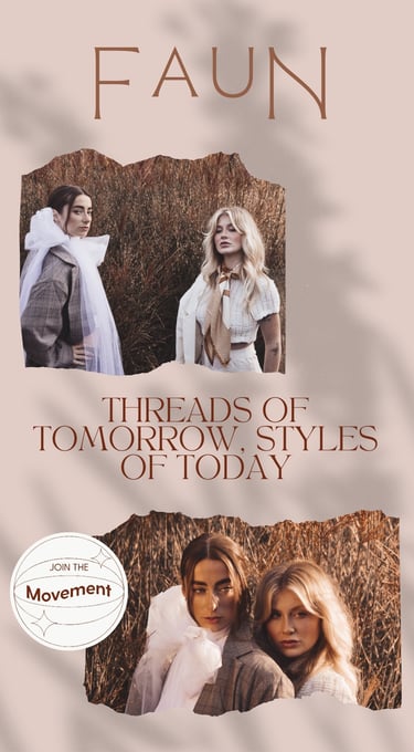
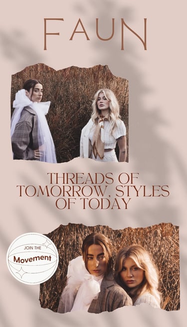
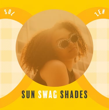
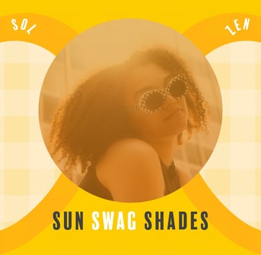
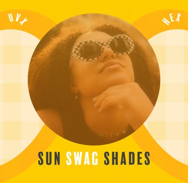
NOTE: Photos provided by company and visual design by me
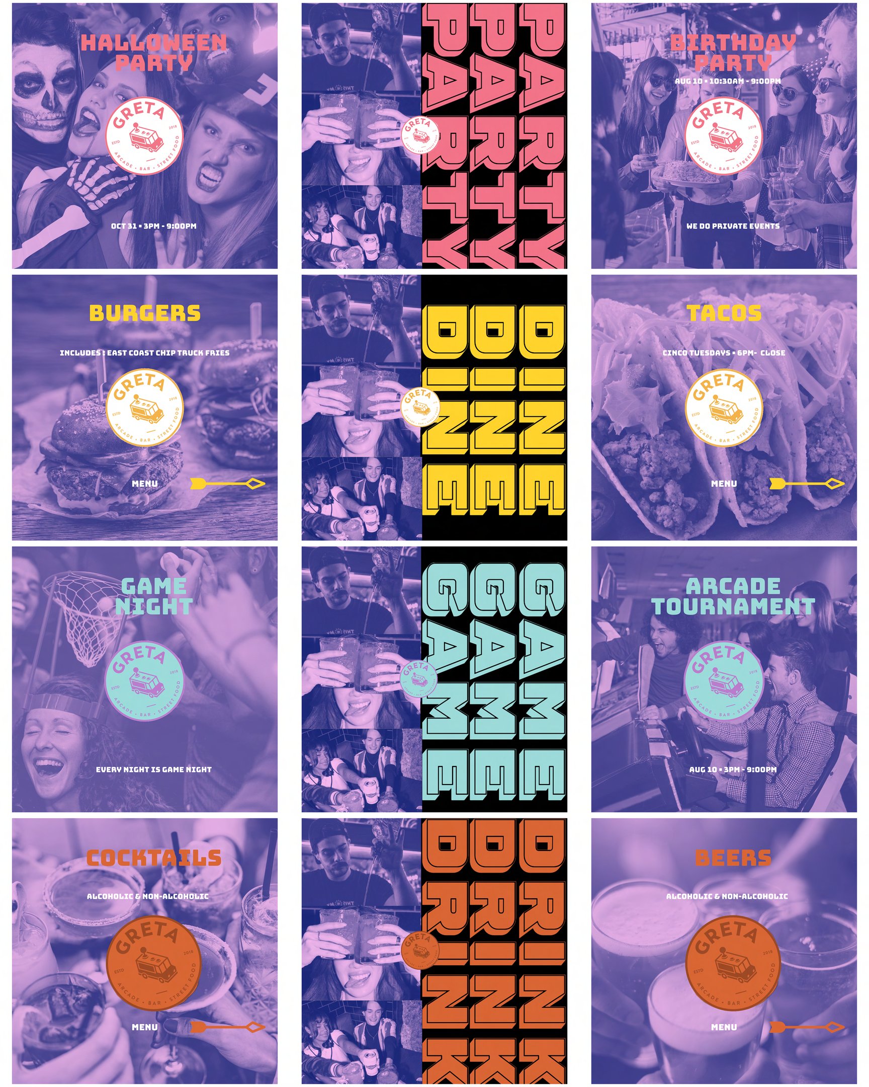
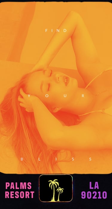
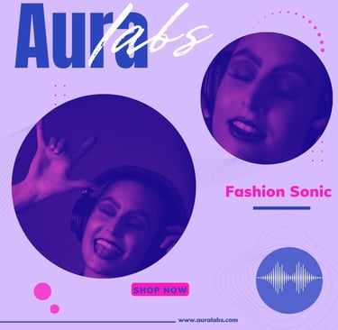
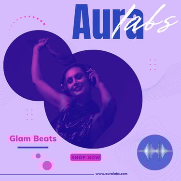
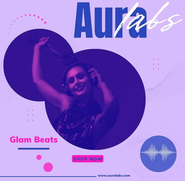
For Greta, an arcade and bar, I leaned into the vibrant, multicolored theme from their existing brand palette to create a dynamic and lively social media presence. The multicolor design reflected the brand’s identity as a go-to spot for partying, dining, gaming, and drinking, making it clear that it’s a hub for fun and entertainment. I repeated the logo in various creative forms across the posts to reinforce brand recognition and ensure consistency. Incorporating photos in various contexts—both group and solo shots—to highlight that all types of people can have fun, whether they’re out with friends or enjoying a solo experience. A soft violet duotone was applied to convey the brand’s vibrant and playful atmosphere. This color choice also proved effective when integrating user-generated content or in-house photos and videos, ensuring a consistent visual identity across all media. It emphasized the inclusive, lively ambience of the arcade and bar, showing that it caters to everyone, regardless of the occasion. This approach helped build brand awareness while maintaining the excitement and energy associated with Greta’s experience.
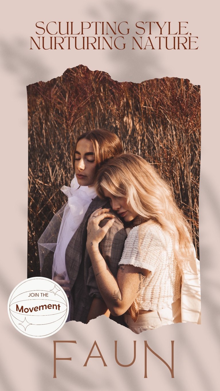
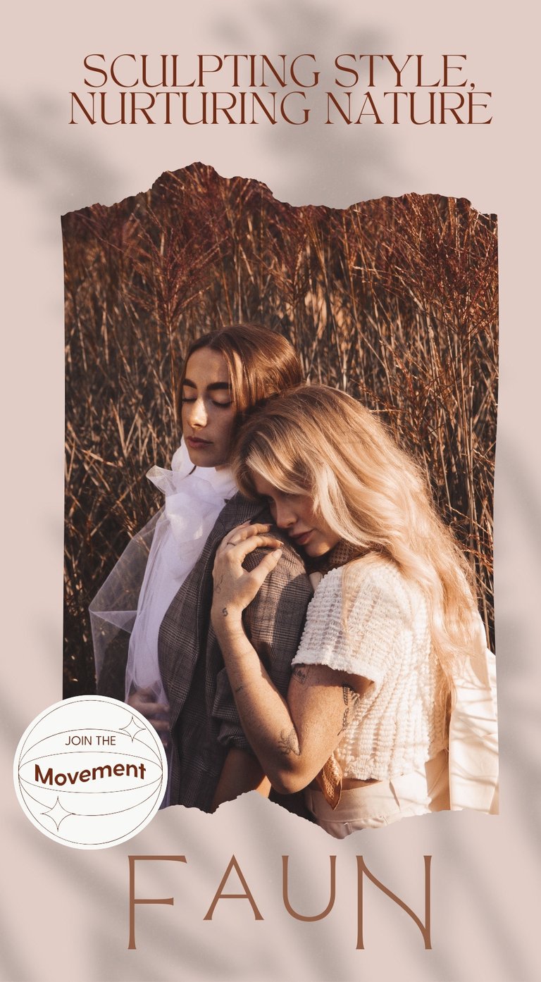
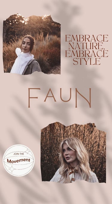
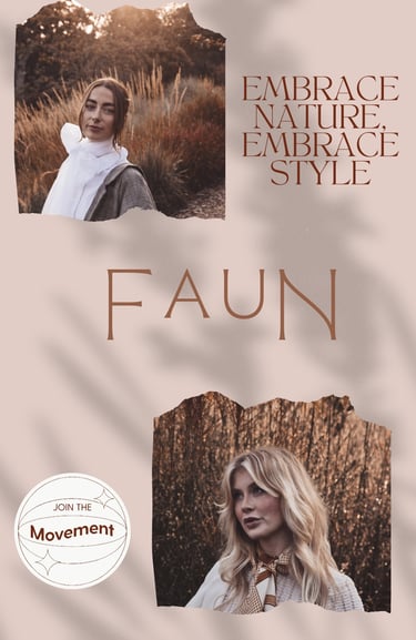
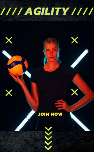
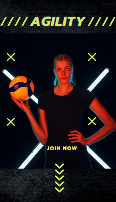
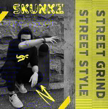
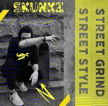
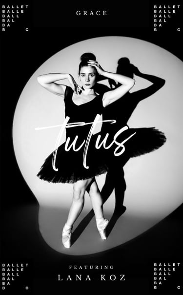
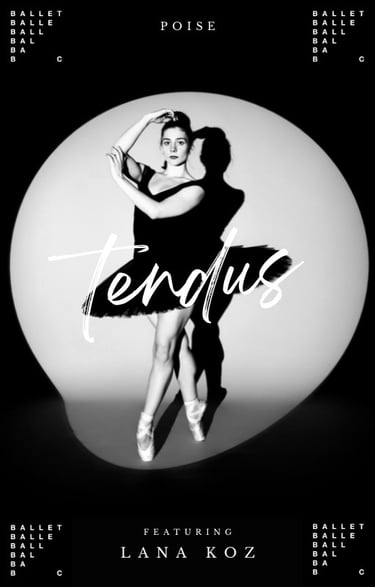
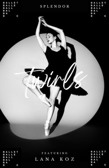
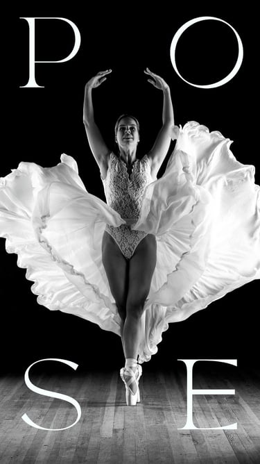
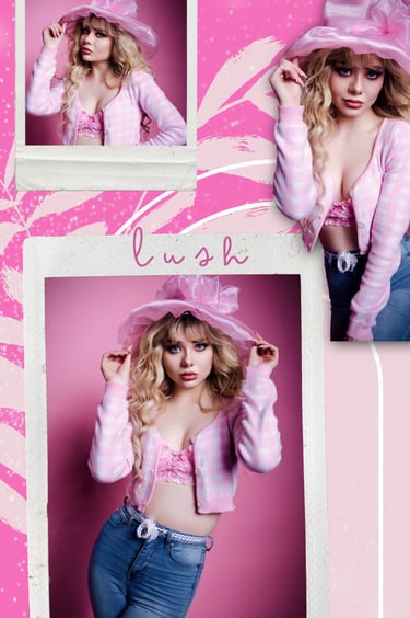
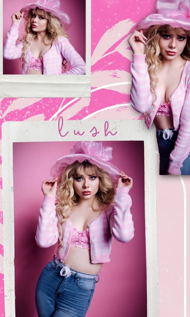
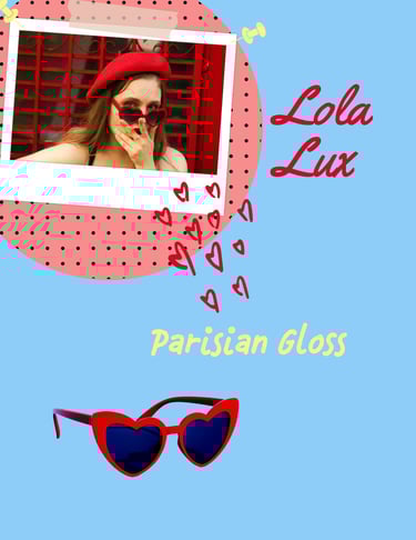
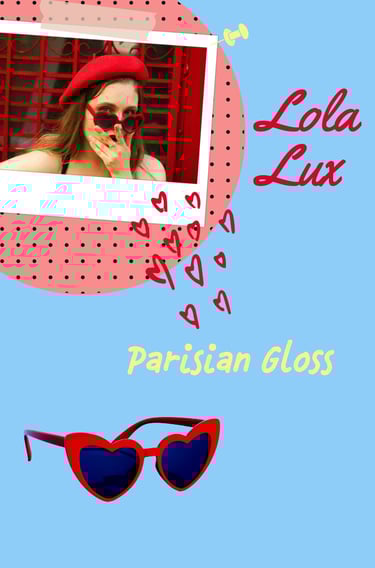
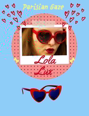
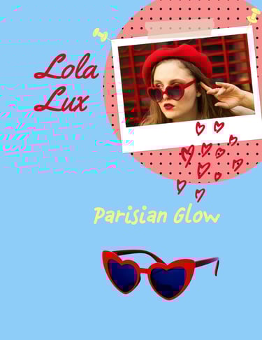
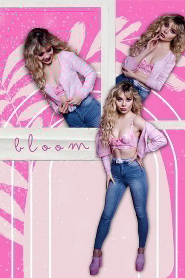
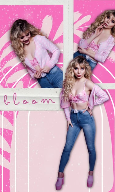
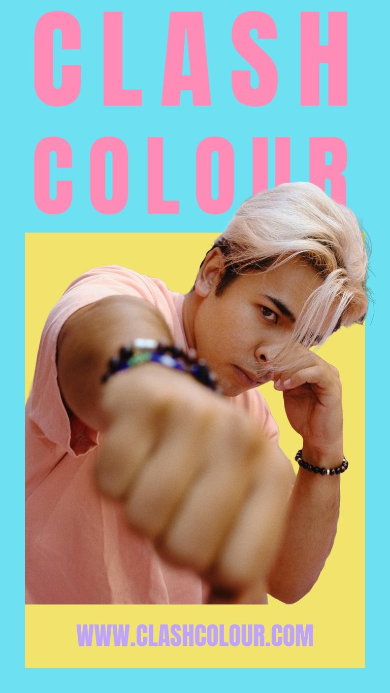
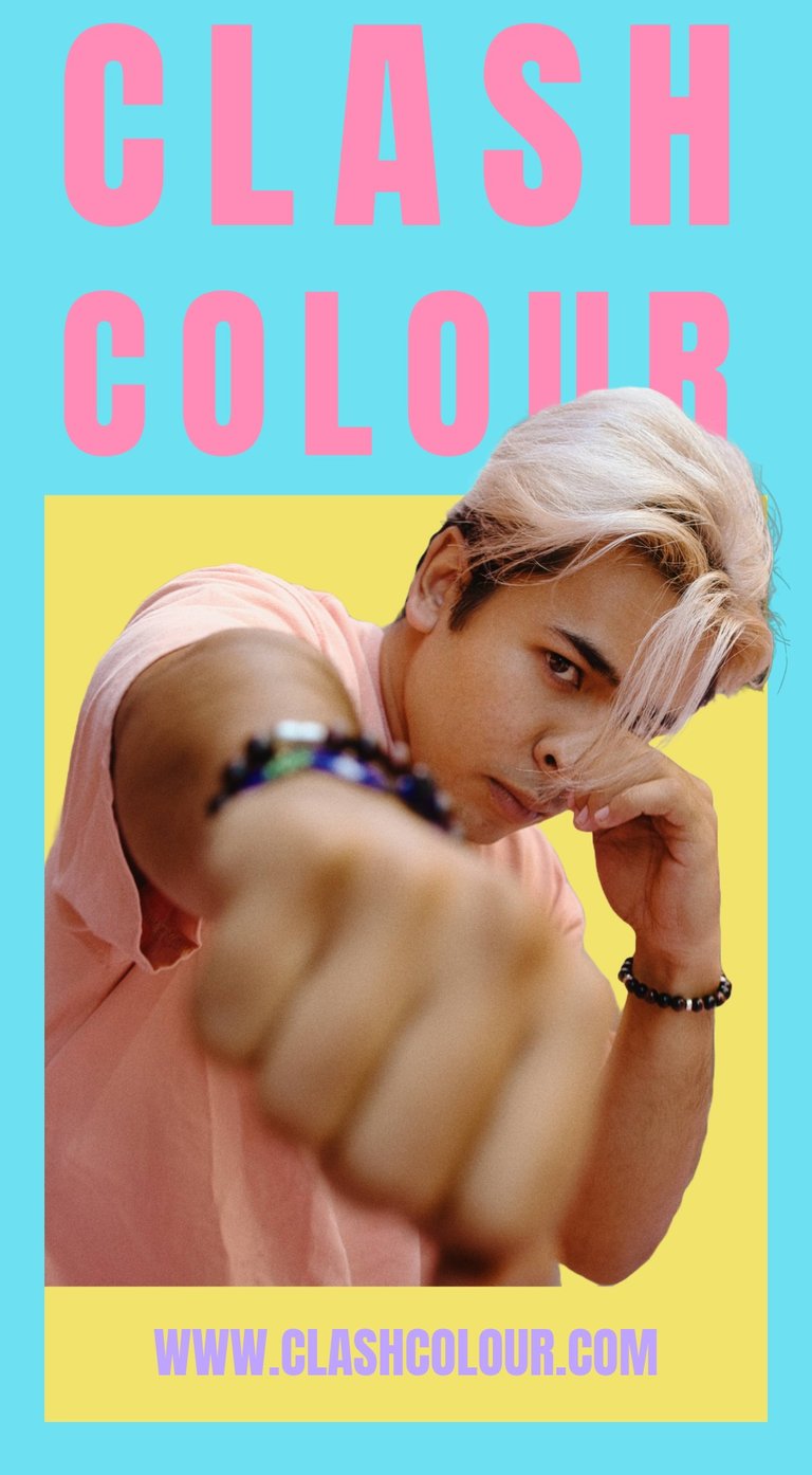
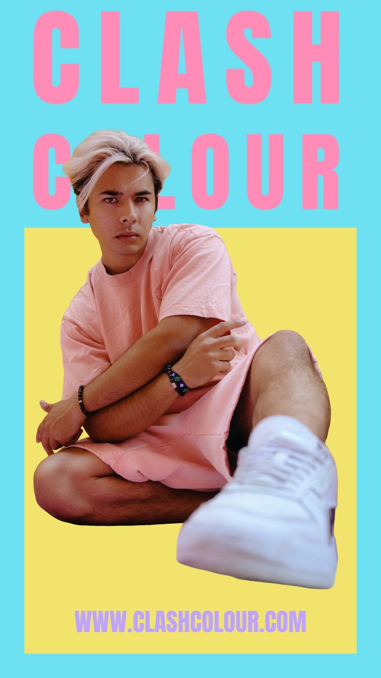
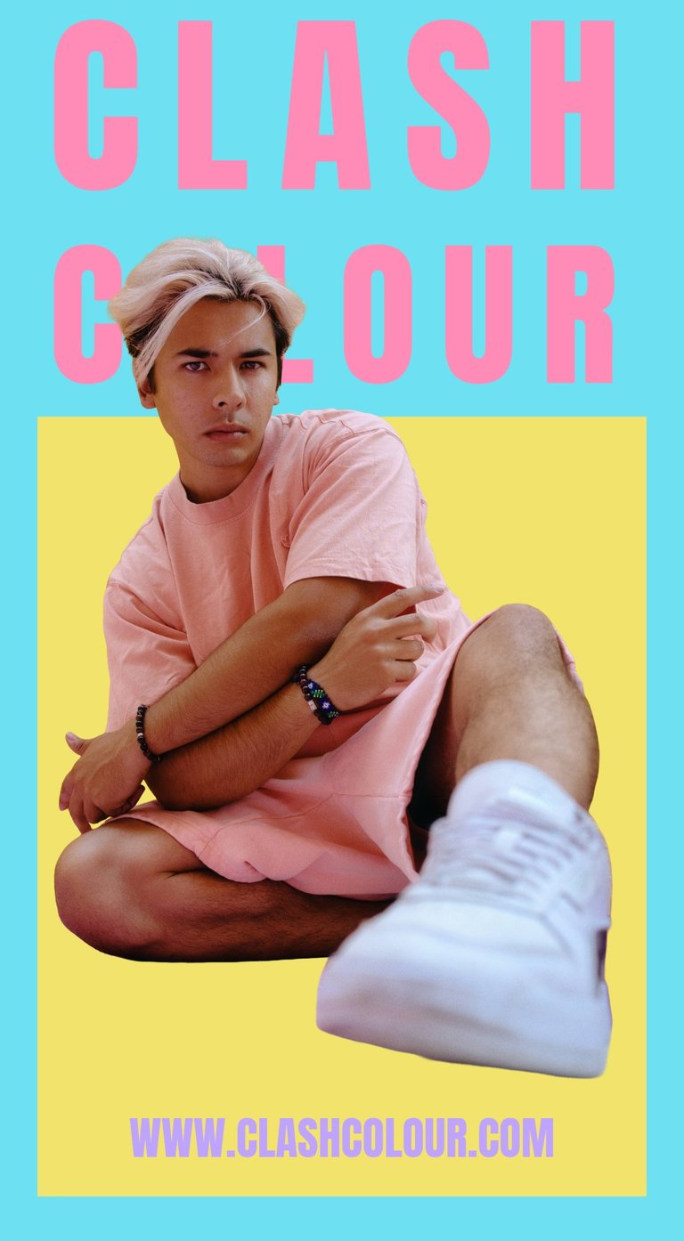
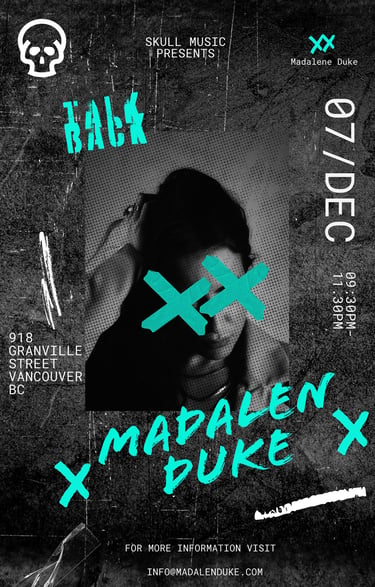
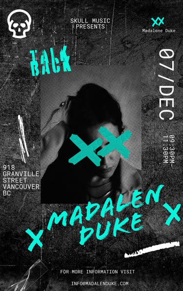
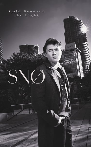
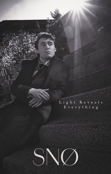
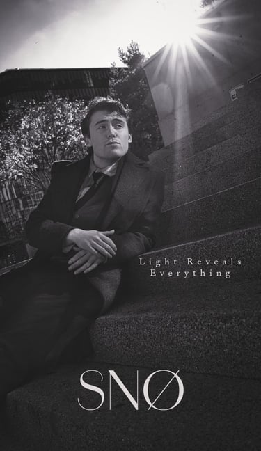
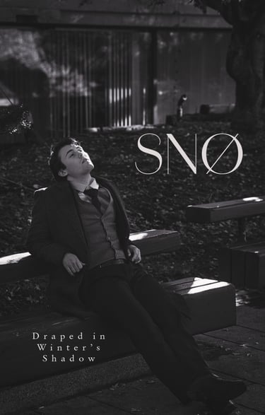
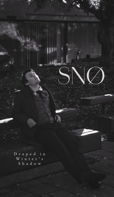
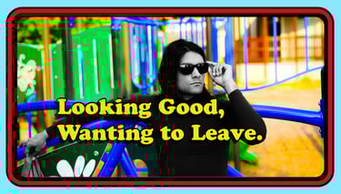
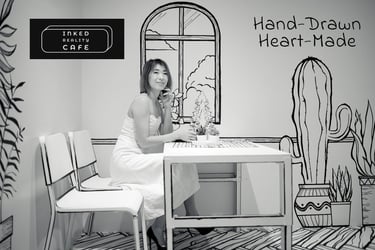
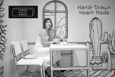
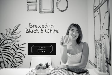
NOTE: From here onward, all content includes my photography and design.
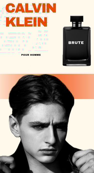
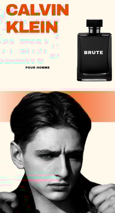
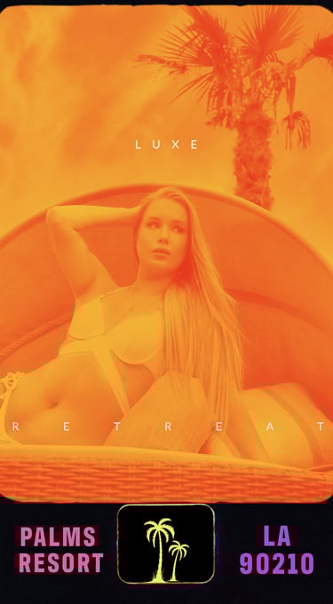
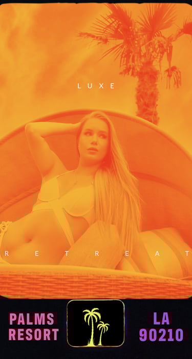
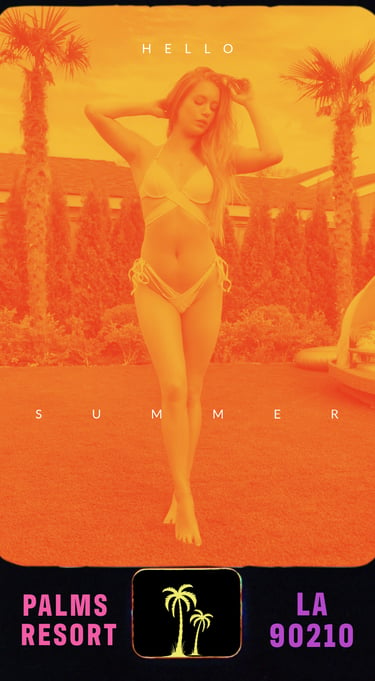
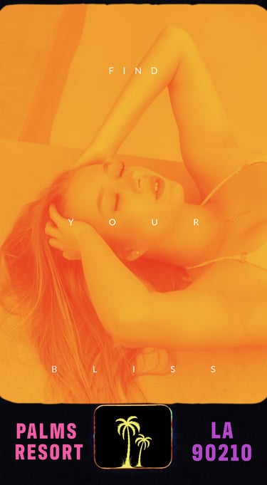
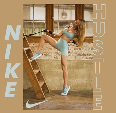
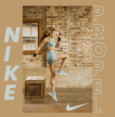
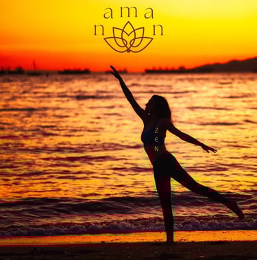
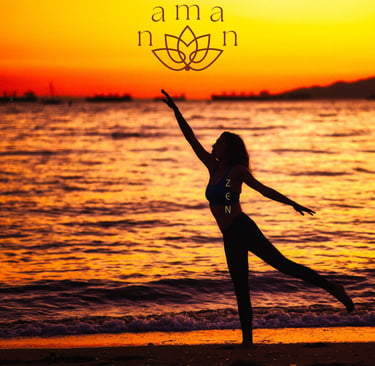
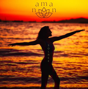
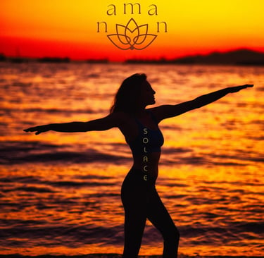
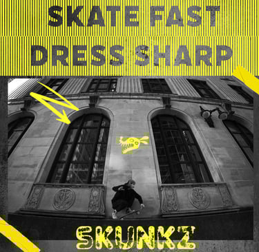
NOTE: Photos supplied by company and visual design by me